
Sometimes when a client with an existing brand asks us to make collateral, there can be issues when it comes to matching the brands colors.
For example sometimes the color looks different on paper than it does on a computer screen, and vice-versa, or the color on a painted wall can look different depending on how the lighting in the room hits it. As you can imagine this can be very frustrating to the client and the marketing team.
Here are some of the issues that might have an effect on the colors you’re seeing:
-Printing the digital version may result in distorted color.
Let’s say you are provided with a logo file that was digitally designed using RGB (red, green, blue) color schemes. When you go to print them, the colors are translated to CMYK (cyan, magenta, yellow, black) color schemes. CMYK can actually only print 70% of the colors that are available in RGB, which will result in colors that are a little off, and not as bright.
The opposite effect will happen when you try to view an image meant for print, on your computer.
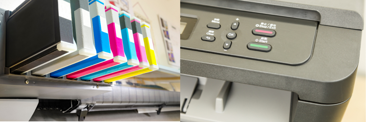
-Printing on a home or office printer provides different results.
There are a few reasons why you may be disappointed with how an image turns out when you print from your home or office printer.
The first issue would be digital image size or quality. If you’re trying to print an image that was uploaded to a social media site, the quality of the image will be significantly lower than the original version of that image. Social media sites compress image files. This will result in poor quality printed images. Especially if you want the image to be printed larger than how it looks on your screen.
Another issue you will find is actually pretty self explanatory. When you view an image on a computer screen, that image is being shown with the bright light of the computer screen illuminating the image. So when you go to print the image, it will look duller and darker.
The next issue you will see from your home or office printer is just the quality of your printer. Most home and office ink jet printers are not designed to print professional quality images.
If you need to use a home printer or office printer for high quality printing there are some things you can do to get better prints:
- Make sure you have the highest quality image files available
- Make sure your monitor isn’t set to super bright. Darkening the screen will give you a more accurate portrayal of the image for print.
- You can calibrate your monitor to specific settings designed for printing.
- Test print and make adjustments.
- And finally, you can always purchase a better quality printer, or have your peice it professionally printed.
.png)
-The material of paper will vary the color.
Paper is paper, right? Not even close. Here are some factors that different types of paper can play on how your image looks after printing.
- Color of paper: You may think that there is only one type of “white” paper, but in fact there are many different shades of “white” paper, and each one will show a printed image slightly different.
- Coated vs. Uncoated: A coated piece of paper will reflect much more light, and alter how you perceive the image after printed. There are multiple different options for coating as well, and all will show a print differently.
- Viewing Light: In addition to the color and type of paper distorting your image, the light in which you view the image will also change how it looks. Fluorescent vs. Incandescent vs. Natural sunlight will make colors appear very different.
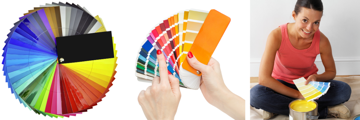
-Brand Colors based off Paint Swatches
For all of the reasons above, basing your colors solely on paint swatches can make it extremely difficult to match your brand colors for use in digital and print form. When asking a paint company to provide a color code for a paint swatch, you typically will only get an RGB/HEX code. These are color systems exclusively for web and digital displays, and they don’t translate perfectly to print. Secondly, RGB/HEX values may appear different depending on the type and settings of your digital screen.
There are conversions you can find online for the CMYK equivalent, but you won’t be able to match it 100%.
I hope this sheds some light on the common issues that are presented when trying to match brand colors in different applications.
References/Credits:
–https://www.huckleberrybranding.com/why-colors-look-different-on-screen-vs-when-printed
–https://samcoprinters.com/paper-affects-colours
–https://www.howtogeek.com/397798/why-do-photos-look-different-when-i-print-them/