I felt like eating fresh last week and decided to hit up my local Subway for a foot-long meatball sub. Little did I know this would lead to a series of observations prompting a new blog series!
Welcome to “We’ll Be the Judge of That” Subway rebrand edition! A series in which we, the branding experts, review rebrands of popular companies, decide whether it was worth it, and give the rebrand an overall final grade.
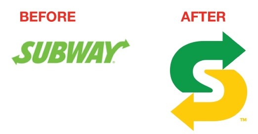
So I walked into my local Subway and did a double take. Something was different. The sandwich artist behind the counter was wearing a different hat with a new “S” monogram on it. That’s the first change I noticed. Subway has never had a monogram before, choosing instead to fit their full logo into a square.
After I ordered and received my foot-long meatball with extra provolone, I noticed something else: the sub wrapping paper was different! Gone are the days of the massive sub wrap that makes eating on the go such a hassle. Welcome to the era of the tiny, efficient sub wrap.

As a final touch, they included their new monogram on a sticker designed to seal the wrapper, not the most innovative idea ever, but it does create a better experience for the user/eater.Not only was the wrap much smaller, it was also printed with a new pattern of green and yellow arrows on one side and the new monogram on the other. It also had a printed message asking you to recycle it.
Digging a little deeper, I noticed Subway is using a different font in their logo. The font in the old logo was outdated. This new font is modern and works well in both print and online.
While Subway didn’t go all out with a huge brand overhaul, they successfully modernized their look and feel and introduced new elements that help them communicate their values and progression as a company focused on the customer experience.
So was this rebrand worth it? Absolutely.
But at the end of the day, we give this rebrand a B. Points for taste and subtle communication, but low marks for lack of a complementing marketing campaign.
A rebrand designed to show new company values and fresh healthy food should be rolled out at the same time as marketing campaign communicating the same thing. This provides consistency in the marketing mix and shows the customer fresh messaging capitalizing on their investment and supporting the fresh look and feel.
This was a missed opportunity for Subway, but check out that monogram! And the new stickers! After a rough year, this lunchtime giant definitely has the potential for brand improvement. We’d say their new identity is a great start.
If you enjoyed the first installment of our new series, we think you’d love our latest eBook! Click below to harness the power of your brand to create a better lead generation campaign.
{{cta(‘e06c8fd0-1f75-40e1-8aee-b0a4942f944b’)}}