Welcome to the second installment of We’ll Be The Judge of That! A fairly new blog series in which we, the branding experts, judge business rebrands and give them a grade on their work.
This particular installment is inspired by the other day when I got home from work, grabbed the mail, and found a bill from the gas company. While no one is ever particularly excited to come home to bills, this one was different.
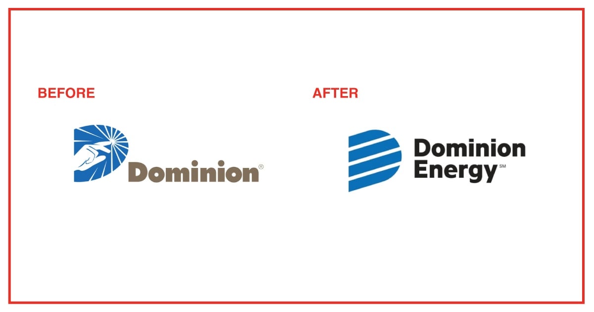
Inside the envelope was a slip announcing new branding for the gas company formerly known as Dominion East Ohio. It had been renamed Dominion Energy and given a fancy new logo. The flyer I received listed all their offerings and clearly defined to me, the customer, what Dominion Energy did.
The new logo doesn’t stray too far from the former established brand identity, but it has a modern and simplified look.
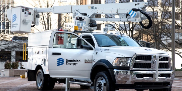
As I am a huge nerd who gets excited by marketing and branding strategy, I was stoked. And as I examined the flyer, a truck drove by, already sporting the new Dominion Energy rebrand logo. Talk about perfect timing.
Later, when I went to their website to pay my bill, new messaging, new branding, and what appeared to be a thought-out and strategic brand rollout plan, hit me hard. Still later, as I drove down the highway, I noticed a billboard touting the switch. The board was well-designed and the message was simple: Dominion East Ohio had rebranded.
In a press release from the company, Dominion states their goals in rebranding are to unify the brand after a merger with Questar Corp. last year and to reflect the evolving energy market. They want to communicate the ultimate goal of safely and dependably serving their customers.
We think this rebrand is a huge success. Dominion addressed every touchpoint from logo to advertising prior to the launch and they have a clearly developed message to communicate their rebrand to customers and the general public. The strategic decisions behind the updated brand make perfect sense.
The previous brand felt outdated with a more complicated logo. By modernizing it, their identity feels professional with a more corporate slant that aligns better with their goals. Dominion is located in 18 different states and is trying to communicate safety and dependability to 18 different markets. Making their brand a bit more serious helps convey these values. The logo shows trust, efficiency, and a dash of the professionalism that was missing from their previous look.
Shout out to Dominion for their:
- New name that’s still reminiscent of the old name, as not to cause confusion.
- Nicely updated logo.
- Clear rebrand messaging.
- En masse and highly successful rollout in advertising.
This rebrand had all the elements required for success. We’ll be paying our energy bills with a little more enthusiasm from now on.
Grade: A+
While you’re here, we have an offer we think you might like if you want to learn more. Check it out!
{{cta(‘5ec881f2-c32d-42e8-bbb8-a6e592c52bdb’,’justifycenter’)}}