Last week, determined to work more vegetables into my diet, I ventured over to Tropical Smoothie for a smoothie loaded with kale, spinach and other green goodies. As I pulled up, I was pleasantly distracted by Brio (a national Italian restaurant chain with a location near our office) and its rebrand!
Until now, Brio was often confused with its sister restaurant, Bravo. It was perceived in the marketplace as a “higher-end Bravo” rather than its own, separate establishment. Not only did Brio need to differentiate itself from Bravo, it needed to differentiate itself from other high-end Italian restaurants.
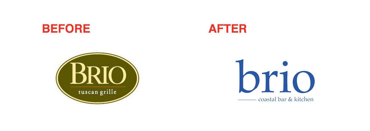
The first thing I noticed was a change in color. Originally, their colors were green and red, reminiscent of the Italian flag and common in many Italian restaurants. They replaced the generic color scheme with a “Coastal” blue. The color is inviting, warm and has a modern feel to it.
I then noticed below the new logo, they’ve added a new company descriptor: Brio – Coastal Bar and Kitchen. This new descriptor is a new brand position in the marketplace that sets them apart from other Italian restaurants.
As I was creepily checking out the new signage and the rebranded exterior I was greeted by a smiling face in a chef’s coat. The colors matched the new brand identity and as he turned I noticed the new logo on the crest of the jacket.

His name was Eric Sanchez, the Sous Chef for Brio. He informed me that Brio has rolled out its rebrand just a few weeks ago. He seemed really excited about the change and eagerly started to talk about the new menu. Eric showed me the menu posted outside of the restaurant and explained that they not only changed the logo and colors, but it was a complete revamp of the restaurant.
The menu items, the interior, everything was new. As he began to give me a tour of the restaurant, I noticed that the new brand position was the star of the show. Everything tied back to the “Coastal Italy” theme.
The new menu features a small plates section, an offering commonly found on the Italian coast. The goal was to encourage sharing and “family style” dining and cut ticket times down. The new menu items have a larger focus on fresh, healthy and light options common to the Italian Coast area. They have added infused drinks and a renewed focus on the bar. Who doesn’t want a cool cocktail or fun coastal drink when they are taking a break from the Italian coastal beach?

The menu is designed and executed very well. The hierarchy and layout pushes the viewer to review the small plates first and communicates the importance and focus of these menu items.
As we entered I truly felt like I was entering a relaxed but exciting coastal restaurant. It still has the feeling of a restaurant you need to clean up for, but they’ve ditched the “white table cloth” formal feel. The new whites, blues, greys and wood texture tie the environment back to the brand positioning.

The messaging also reflects this energy with lines like “Experience the fresh flavors and relaxed atmosphere of Brio Coastal Bar & Kitchen. Recipes for everyday life.” Which helps paint the picture for the consumer and provide some insight into what to expect.
When I asked Eric why the company went through the rebrand, he said they wanted to reach new demographics while still delighting their current customer base. He said the new brand is based on current trends in the market identified at West Coast locations. While he feels that Cleveland wasn’t quite following these trends just yet (and I agree), the company wants to stay ahead of the curve and continue to innovate for their customers.
Not only did Brio successfully communicated the changes that they were making with their rebrand, they successfully explained the “why.” Having a reason behind a rebrand creates buy-in from employees which helps smooth transition when rolling out the new brand.
In a world filled with generic Italian restaurants, I am excited to see Brio position themselves in a unique way and put their own twist on Italian cuisine with a focus on the Italian Coast. The research and attention to detail they put in to creating this new experience is reflected in the culture, food, style of dress and overall coastal Italian vibe. Every little detail in this rebrand was thought through and every experience and interaction the consumer has with the brand was considered. This is what makes a phenomenal brand that has staying power and memorability.
Are you going to try out the newly rebranded Brio in Legacy Village? We’ll see you there!
Brio Rebrand Grade: A+!
And don’t miss out on the latest free offer from Hey Now! Media!
{{cta(’38dac721-6f0b-45c2-86df-2eadcf9f344c’)}}