As your business changes and grows so should your logo and branding. Color is a super strategic element and is definitely worth revisiting. Take a look at the metamorphosis Starbucks went through as their business changed.
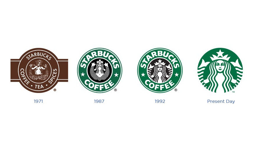
This switch from brown to green though minor in thought makes a huge difference, and that change didn’t occur for 16 years! How does the color change make you feel? Do you have a different response to the two logos?
We recommend choosing a primary color and an accent color. Many colors evoke certain emotions and you might want to keep that in mind when choosing your colors. Here is a condensed reference guide to consider:
- Blue: Cool blue is perceived as trustworthy, dependable, fiscally responsible and secure. Strongly associated with the sky and sea, blue is serene and universally well-liked. Blue is an especially popular color with financial institutions, as its message of stability inspires trust.
- Red: Red activates your pituitary gland, increasing your heart rate and causing you to breathe more rapidly. This visceral response makes red aggressive, energetic, provocative and attention-grabbing. Count on red to evoke a passionate response, albeit not always a favorable one. For example, red can represent danger or indebtedness.
- Green: In general, green connotes health, freshness and serenity. However, green’s meaning varies with its many shades. Deeper greens are associated with wealth or prestige, while light greens are calming.
- Yellow: In every society, yellow is associated with the sun. Thus, it communicates optimism, positivism, light and warmth. Certain shades seem to motivate and stimulate creative thought and energy. The eye sees bright yellows before any other color, making them great for point-of-purchase displays.
- Purple: Purple is a color favored by creative types. With its blend of passionate red and tranquil blue, it evokes mystery, sophistication, spirituality and royalty. Lavender evokes nostalgia and sentimentality.
- Pink: Pink’s message varies by intensity. Hot pinks convey energy, youthfulness, fun and excitement and are recommended for less expensive or trendy products for women or girls. Dusty pinks appear sentimental. Lighter pinks are more romantic.
- Orange: Cheerful orange evokes exuberance, fun and vitality. With the drama of red plus the cheer of yellow, orange is viewed as gregarious and often childlike. Research indicates its lighter shades appeal to an upscale market. Peach tones work well with health care, restaurants and beauty salons.
- Brown: This earthy color conveys simplicity, durability and stability. It can also elicit a negative response from consumers who relate to it as dirty. Certain shades of brown, like terracotta, can convey an upscale look. From a functional perspective, brown tends to hide dirt, making it a logical choice for some trucking and industrial companies.
- Black: Black is serious, bold, powerful and classic. It creates drama and connotes sophistication. Black works well for expensive products, but can also make a product look heavy.
- White: White connotes simplicity, cleanliness and purity. The human eye views white as a brilliant color, so it immediately catches the eye in signage. White is often used with infant and health-related products.
Try to create a theme using the primary or the inverse of the main color you’ve chosen, and string this theme through anything that has color.
Remember not to over-do it! The most successful brand colors are simple and tasteful – think Coca Cola, IBM, UPS, and Apple, just to name a few! Most importantly have fun thinking through colors that reflect who you are as a company and help successfully convey your brand strategy.
Learn more about branding and marketing! Click below to download the latest offer from Hey Now! Media.
{{cta(‘ace73b58-274f-4416-bb2e-d0eda8416db3’)}}