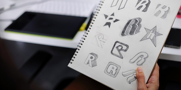
Do logos have magical power? How do they get so deeply ingrained into the lexicon of our lives?
Logos are often solidified over time. Sometimes that means they change (as in the case of Starbucks and Coca-Cola), but other times the brand just becomes so successful that you can barely remember a time without its logo (like the Nike swoosh).
A logo is first and foremost an icon. It is a visual representation of a brand, even if it includes words. The words are stylized, they are illustrated or engineered, and they become a graphic mark. For example, LEGO does not type in the Lego font. That typeface is reserved solely for its logo.
The biggest thing to ask yourself when creating a logo is: How or what do you want people to feel when they interact with your brand?
A lot of people approach the logo with the flawed mentality of choosing things they like. The logo is an incredibly strategic piece of your brand and you must remove your ego from the process in order to create something successful.
When thinking about what you want people to feel, it’s important to understand that a logo can only convey so much. Try making a list of what you want people to feel when interacting with your brand, then put it in order of the emotions and feelings that matter most to least.
Then understand that you can probably only pack 2-3 things into the logo. But fear not! You can incorporate more of the feelings and emotions on your list throughout the brand identity. If your brand was a baseball team, your logo isn’t the only player – it’s just an important one, like a pitcher (how far can we take this metaphor?).
Let’s look at a couple examples to help illustrate this.
Apple
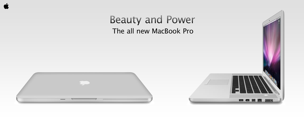
Apple. Iconic, memorable. Is it warm? Does it say, “family brand?” No way. The highest priority here is conveying innovation.
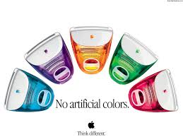
The logo combined with the tagline “Think Different” works to drive this concept home. If Apple had worked to incorporate other feelings like warmth into its logo it would dilute the impact of “innovation.” They don’t want to be known for warmth and innovation – they want to be the most innovative brand in the world.
Underlying their brand secondarily is creativity, which they incorporate in their campaigns. Notice that their campaigns are “fun,” but this concept is not present in the logo. Do you see how these things work together to give depth to a brand?
Coca-Cola
CocaCola = Happiness. Like Apple, Coke has narrowed their brand down to one key emotion or feeling. The brands that are able to do this are often the most successful as their logo and identity infrastructure isn’t tasked with communicating too many ideas.
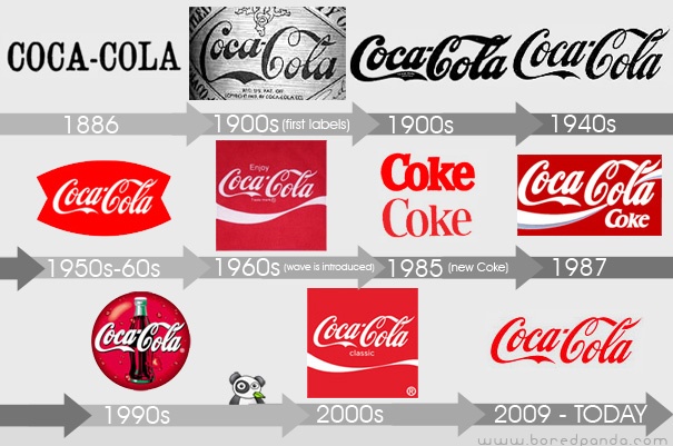
This brand has changed a ton over their 132 years. Their cursive font creates warmth while using red conveys power and passion, confidence, energy, and intensity. This combination of energy and warmth hints at the brand’s overall happiness concept which is then reinforced through their myriad campaigns.
What does your logo say about you? Does it communicate the feelings and emotions you want people to feel when thinking about your brand? Or are you trying to say too much at once?
Become a marketing rock star! Click below to download the latest free offer from Hey Now! Media and perfect your brand.
{{cta(‘ace73b58-274f-4416-bb2e-d0eda8416db3’)}}
