The creators of the Pantone Color Matching System (PMS), an industry standard that allows designers to “color match” specific colors when a design enters production stage, released their 2016 Color of the Year today. The company said “PANTONE proudly announces the Color of the Year 2016 as Serenity and Rose Quartz, a harmonious pairing of complementary shades. The seamless union of Serenity and Rose Quartz creates balance in a chaotic world by providing the perfect counterpoint to the fast-paced, fractured and hurried lives we live.” Accompanying the announcement, is a video illustrating the “fast-paced, fractured, and hurried lives” juxtaposed with the winning colors displayed through flowing fabrics, calming music, and nature scenes. Basically the winning colors are what baby shower dreams are made of, a pastel pink and blue that are both soft, warm, and quietly complimentary.
Pantone declares a “Color of the Year” annually and it often is a reflection of the past with a strong message towards the future. Specifically Pantone defines it as “A color snapshot of what we see taking place in our culture that serves as an expression of a mood and an attitude.” For example, the press release for 2011’s Color of the Year, Honeysuckle, said “In times of stress, we need something to lift our spirits. Honeysuckle is a captivating, stimulating color that gets the adrenaline going – perfect to ward off the blues.”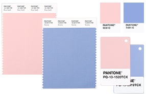
2015’s “Color of the Year” was Marsala, a bold seductive cousin of maroon. This year’s selection is a complete 180 from the confident and bold presentation of 2015, additionally it is the first time that two shades have been introduced collectively.
The Pantone Color of the Year is often used to help guide consumer facing companies in their designs, planning, and purchasing of future products. Just a couple hours after the release, kitchen gadget giant KitchenAid introduced 2 new kitchen stand mixer colors based off of the Pantone Color of the Year. Expect other consumer facing products to follow suit, as well as fashion houses, interior design trends, and make up too.
Even as I’m writing this, I do feel a sense of calm, a less hurried pace, and taking time to write about something so unaffected like color, in the midst of yesterday’s horrors is maybe one way we as a society can begin to heal and focus our energies away from hate, anger, and mistrust, and back to regular old life.