These days, due to the increase of internet usage, almost every business has a website. With that number constantly growing, it’s important to have yours stand out among the rest. Looking for some inspiration in terms of functionality and design? Take a look at our Hey Now! Media Art Director, Chad O’Malley’s top 5 list of websites he loves. This will help you gain some insight on what to look for when creating or improving a website of your own! Let’s jump in.
YouTube
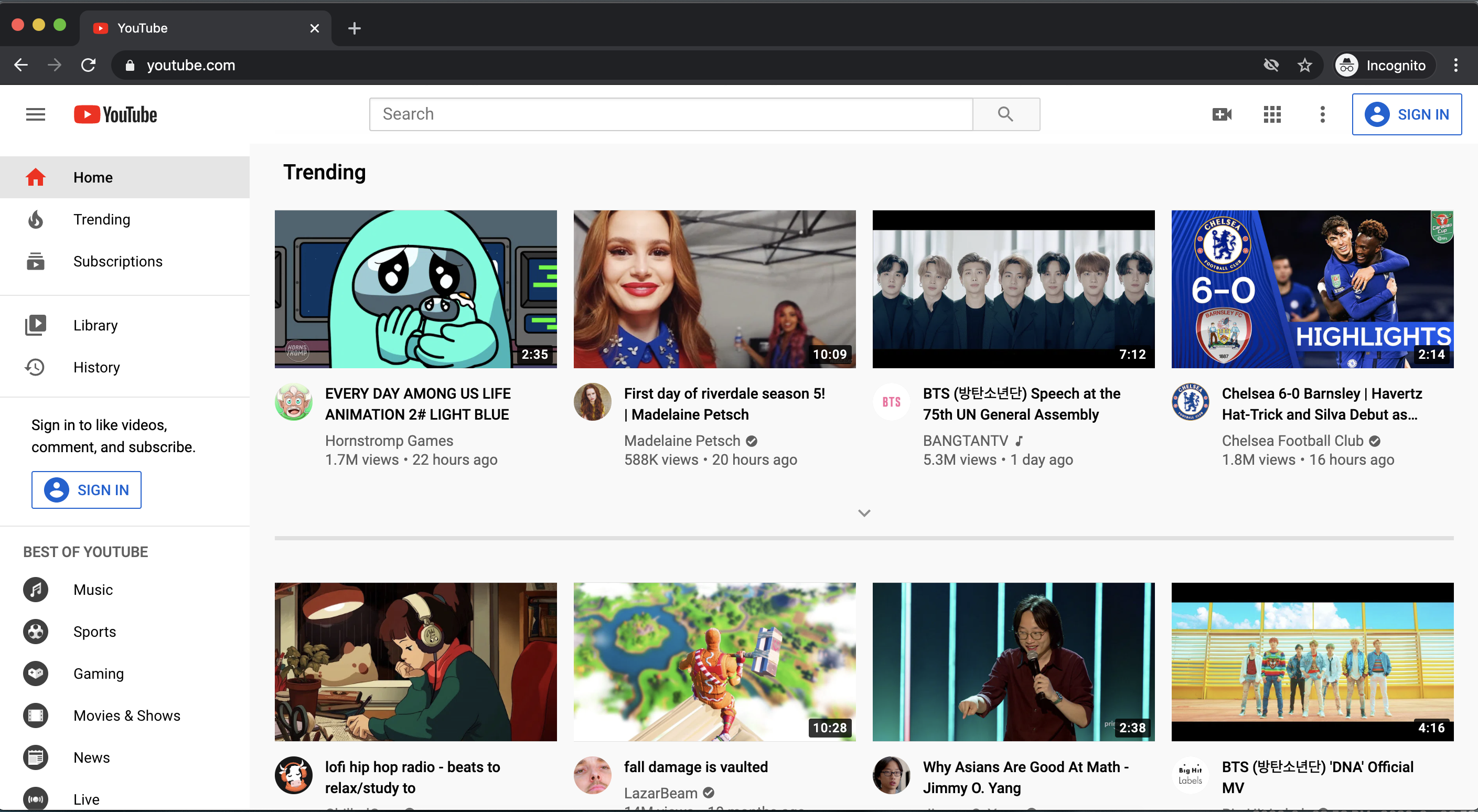
First we have Youtube, a household staple for most. For a website where nearly 5 billion videos are watched every day, Youtube’s overall design places function over form in the guise of a comprehensive dashboard. Immediately upon loading the homepage, you’re greeted with an updated list of videos pulled from your subscriptions and recommendations based on viewing experience. A large search form scrolls with you via a sticky header and a list of left-aligned tabs ensure you can quickly jump to top-level topics.
What is great about Youtube, is the care placed in its responsive breakdown. For a global powerhouse of a service, Youtube’s internal UI/UX team has made sure you have all the same navigation tools and functions regardless of the screen size you’re using.
Due to the sheer number of users and demands placed on Youtube, the design will never be perfect. Yet this shouldn’t put a damper on how impressive it is to create a globally-recognized set of tools that can be used in any format.
The New Yorker
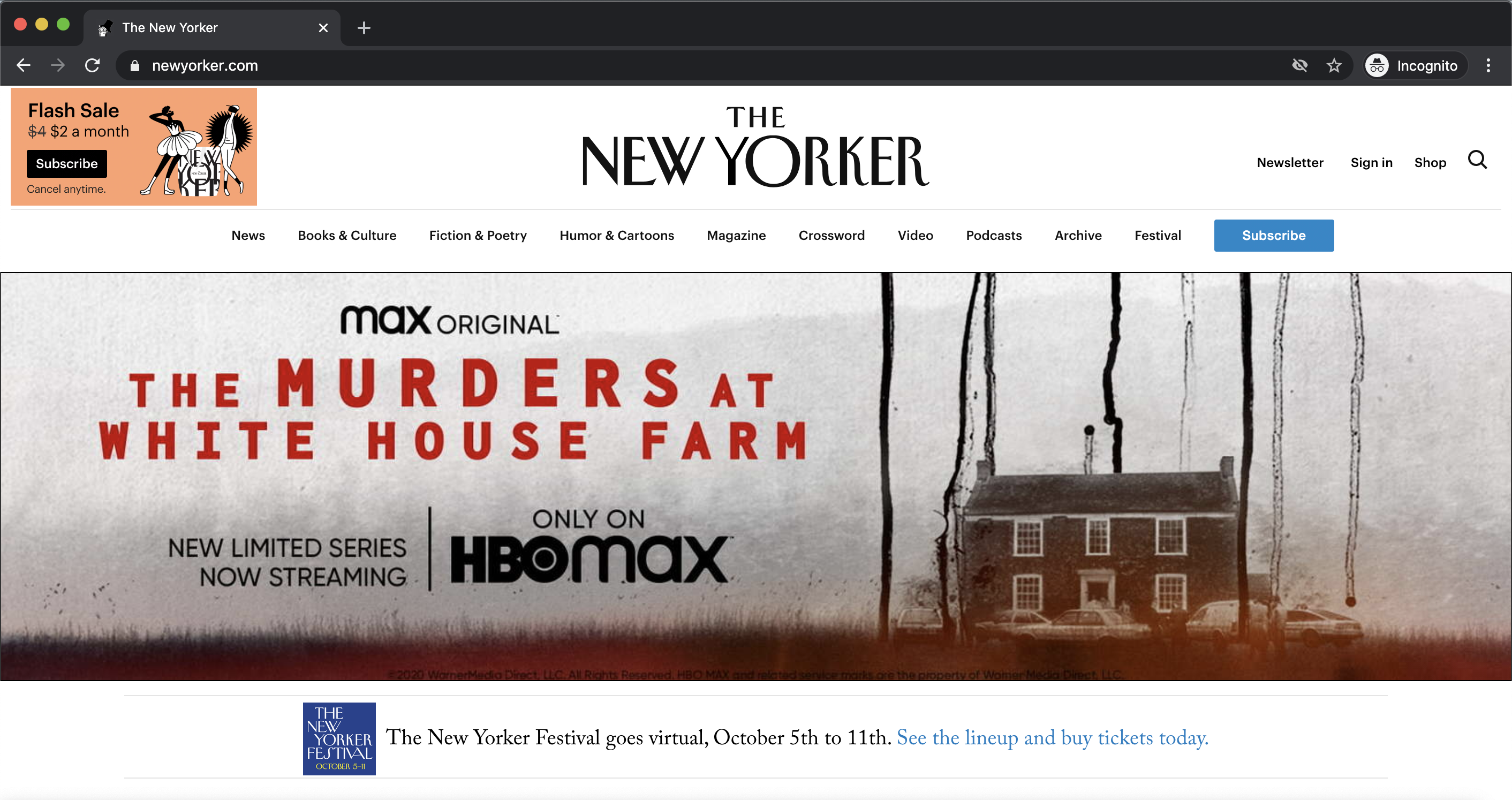
The New Yorker has always been seen as a prestigious publication and their website absolutely follows suit. The site does away with any superfluous clutter, instead focusing just on the copy and thumbnail images. Everything is granted ample padding, giving the user a sense of leisure when scrolling through the page and allowing them to take in all available article headlines. Compared to other publications like the New York Post and Daily Mail, the New Yorker team knows their audience isn’t enticed through large, scandalous photos, but rather prefers to engage in long-read articles.
One thing Chad would love to discuss is the use of a gorgeous serif typeface, NY Irvin, that perfectly mimics the feel of reading the magazine on paper. The typography as a whole is given a greater visual hierarchy simply through the lack of inline images that break up the copy. This is a site for people who want to read and not be distracted.
Avocode
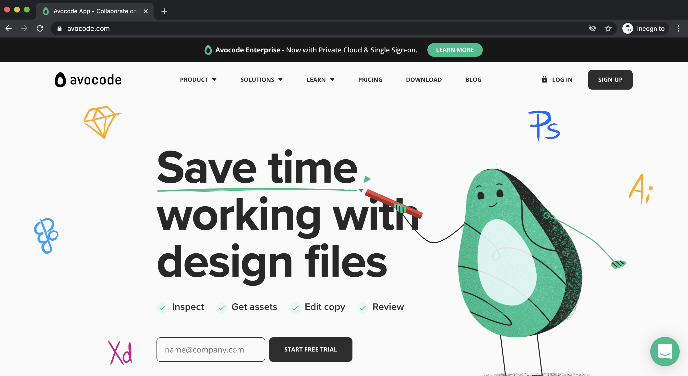
Avocode, software that helps bridge the gap between designers and developers when tackling website projects, has a frankly fantastic website. While this could be an extremely boring topic for anyone not in those fields, Avocode makes sure anyone who enters the site has a clear, simple understanding of their service. Right away you see a blunt headline stating, ‘Save time working with design files’ and key bullet points further emphasizing what it does. Mix this with the friendly design elements found throughout the page and you have an inviting website that is eager to educate you on what it does.
What Chad especially loves about Avocode’s website is their comprehensive sub-pages. The sitemap clearly breaks down the benefits to the various core roles in a website’s creation (designer, developer, copywriter, and manager) with sub-pages tailored directly to their needs. These sub-pages are filled with large, high-resolution graphics and animations that help visually explain how all-encompassing the software is (without making a user feel overwhelmed with information).
Stripe
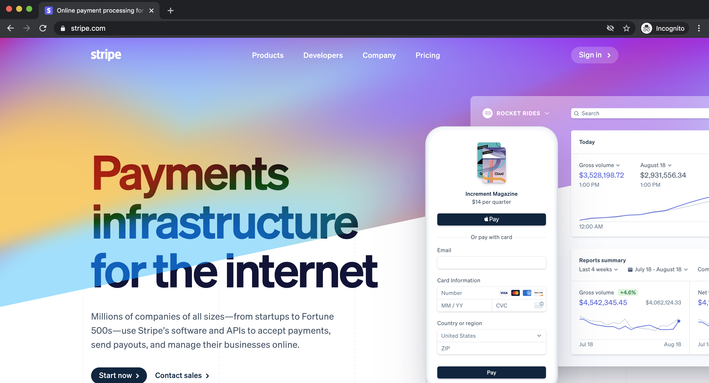
Stripe has always impressed Chad with how creatively aggressive their website and brand elements are. This is a company that has so much confidence in their services they don’t even try to play safe with how everything is presented. You have animated gradient blocks overlapping headline copy, massive, high-resolution images breaking up content blocks as you scroll through a page, .SVG animations for content bucket headlines, and all this without taking up screen space with a (now-standard) sticky header. Stripe knows they’re amazing and wants you to feel the same way when visiting their website.
An interesting aspect of Stripe’s website is how nearly every sub-page has this same level of creative intensity without losing consistency in branding. Whether you’re reviewing the ‘Stripe Terminal’ product page, the company’s ‘About Us’ page, or even just their ‘Jobs’ listing – they have it all. Each page features quick, punchy copy paired with large graphics (both device mockups and screenshots) featuring soft shadows and often at an angle.
The one downside to this excessive sense of design is load speeds. Even on a blazing fast network connection, Chad still encounters slight lag when animations occur for the first time or if the page needs to responsively break down quickly.
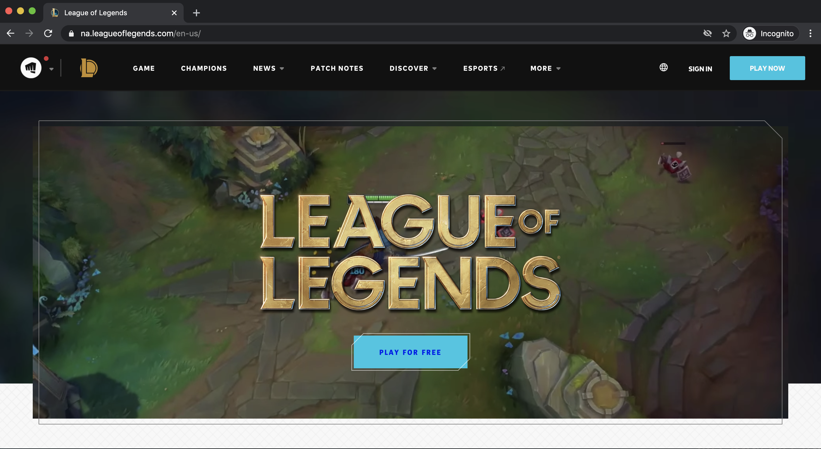
League of Legends
Due to Chad having played the game for over a decade, this may be influenced by his addiction, but League of Legends has consistently put forth fantastic, smart web design and development tricks in their product’s digital presentation. What is surprising about their current website’s homepage is how developer Riot Games is explaining an extremely complicated, team-based game that features 115 million unique players every month. The page doesn’t try to overwhelm the viewer with breakdowns of ‘lane roles,’ ‘gear meta,’ or any other jargon players use, and instead showcases strong videos, graphics, and large call to action buttons detailing how this is a free-to-play title.
Even with the incredibly large player base and a (still-growing) roster of 140+ unique characters to memorize, nothing on the site feels difficult to navigate. All content is clearly labeled with an extremely basic top navigation, the sub-pages are fairly clutter-free with generous padding around graphic elements, and all the copy is clearly contrasted on both light and dark backgrounds.
As you can tell, there are numerous elements that you can utilize to make your website stand out among the rest and improve user experience. Maybe it’s friendly design features, gorgeous typeface, powerful messaging, or creative intensity. Whatever it may be, it is important to have the right website to support your business in increasing website traffic, lead conversions, sales and MORE!
Ready to revamp your site? We’re here to help!
Here at Hey Now! Media we are now offering FREE virtual website audits for you or your business. After some updating, maybe you’ll even make our next list of website’s we love!
Contact us today by clicking below!
{{cta(‘8e2fe627-cdbf-4222-a122-5be05eacaa46’)}}